Posts
Two series, one axis each
A chart with two y-axes lets its designer decide where the lines cross. Small multiples and indexed scales leave that decision to the data.
Few chart forms are as tempting, or as quietly misleading, as the line chart with two vertical axes. The motivation is honest: two quantities with different units seem to move together, and putting them on one chart invites the reader to compare them. The trouble is that the comparison the chart makes is not in the data. It is in the choice of axes.
The crossing is a design decision
#A line chart maps values to vertical positions. With one axis, the mapping is shared, and every visual relationship between the lines is a relationship between the numbers: one line above another means one value exceeds the other. With two axes, each series gets its own mapping, chosen independently. Where the lines sit relative to each other, whether they cross, and how steep they look are all consequences of two arbitrary pairs of numbers: the limits of the right-hand axis.
The two panels below show the same invented monthly series, A on the left axis and B on the right. Only the right axis changes.
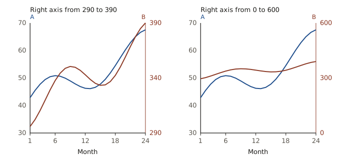
In the left panel, B looks volatile, swings past A, and finishes above it. In the right panel, B looks almost flat, and it is A that overtakes B in the second year. Neither is a lie in the narrow sense: every tick is labelled correctly. But the visual claims, which series grows faster, when one overtakes the other, are invented by the axis limits. A reader who looks at the shapes rather than the tick labels, which is to say almost every reader, takes those claims away.
Why readers trust the lines
#Position along a common scale is the most accurately read visual encoding in Cleveland and McGill’s experiments on graphical perception.1 That is precisely why the dual axis is dangerous. Two lines drawn in the same plotting area look as if they share a scale, so the reader brings the accuracy and confidence that common-scale comparison deserves to a comparison that has no common scale at all.
Colour-coding the axes, a common mitigation, helps a reader who is already suspicious. It does little for one who is not, because the eye compares heights before it reads labels.
Give each series its own panel
#The direct alternative is to draw each series in its own panel, with its own scale, aligned on a shared horizontal axis. This is the idea of small multiples:2 repeated panels with the same design, so that the eye learns the frame once and then compares the data.
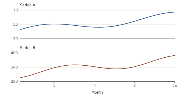
Small multiples make one claim that the data support, that both series rise with a seasonal swing and that their swings do not peak together, and they decline to make one that the data do not, that one series overtakes the other. The comparison of shapes remains easy because the panels are aligned, and the comparison of levels, which is meaningless for quantities with different units, is no longer suggested.
When a single axis is possible
#Sometimes the two series can share an axis after all, and then they should.
- Same units. Two prices, two counts, two rates: put them on one scale and let the gap between them be real.
- Growth rather than level. If the question is which series grew faster, index both to 100 at a common starting point. On an indexed scale, crossings and slopes mean what they appear to mean.
- Ratio scales. When relative change is the point, a logarithmic axis makes equal ratios equal distances, for both series at once.
Each of these makes a definite claim about the relationship between the series. The dual-axis chart makes whatever claim its designer selected, and leaves no trace of the selection.
A short checklist
#Before drawing two y-axes, ask what the chart is meant to show. If the answer is that the series move together, a scatter plot of one against the other shows that directly. If it is that they share timing, small multiples show it without inventing levels. If it is that one overtakes the other, they must share a scale, or the claim is not a fact about the data.
William S. Cleveland and Robert McGill, “Graphical Perception: Theory, Experimentation, and Application to the Development of Graphical Methods”, Journal of the American Statistical Association 79, no. 387 (1984): 531–554. ↩︎
Edward R. Tufte popularized the term in Envisioning Information (Graphics Press, 1990). ↩︎